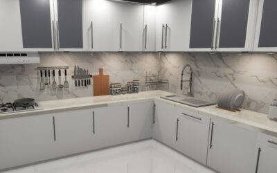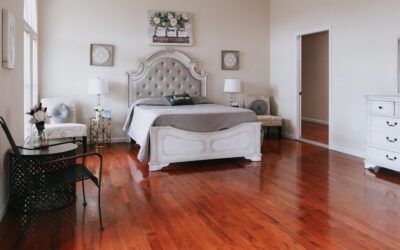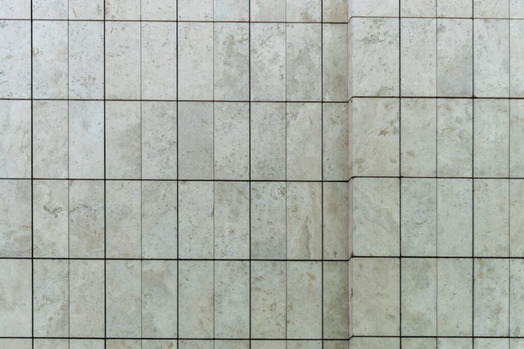
Scrolling through pictures of porcelain tile is where almost every flooring project starts, and it’s also where the most expensive mistakes get made. A photo taken under showroom lighting can look nothing like the same tile in your north-facing bathroom at 7 a.m. I’ve stood in plenty of kitchens with a homeowner holding a phone, wondering why the “warm gray” they ordered came in looking distinctly purple. Knowing how to read those images before you buy saves you from a $2,000 return headache. Let me walk you through what you’re actually looking at.
Part of our Tile & Grout guide — explore the full guide →
The Main Styles You’ll See in Photos
Porcelain has come a long way from the plain squares of the 1990s. Digital inkjet printing now lets manufacturers mimic almost any natural material, and the photos reflect that range. When you browse galleries, you’ll run into a handful of dominant looks.
Wood-Look Porcelain
These planks copy oak, hickory, walnut, and reclaimed barnwood down to the knots and grain. In pictures they run 6×24, 8×48, or even 9×60 inches to read like real boards. Look closely at how many different plank faces the photo shows. Cheap lines repeat the same three graphics over and over, and once installed the pattern jumps out at you. Quality lines like MSI’s or Marazzi’s better collections offer 15 to 40 unique faces.
Marble-Look Porcelain
Carrara and Calacatta reproductions are everywhere. Good photos show the veining running edge to edge, and on rectified, polished tiles the pattern can flow across a whole floor. Watch for veining that looks stamped or too symmetrical, that’s a tell of a low-resolution print.
Concrete and Cement-Look
Flat grays, taupes, and soft whites with a subtle mottled surface. Popular in modern and industrial designs. In pictures these read calm and seamless, which is exactly the appeal.
Terrazzo and Stone-Look
Terrazzo speckle patterns are back in a big way, and porcelain versions photograph beautifully because the chips are printed at high resolution. Slate, travertine, and limestone reproductions round out the stone category.
Reading Color the Right Way
Color is where photos lie the most. A monitor throws its own tint, and manufacturers photograph tile under bright, neutral studio light that your home rarely matches. When you look at pictures of porcelain tile online, treat the color as a starting point, never gospel.
Grays are the trickiest. What a website labels “greige” can lean green, blue, or pink depending on the undertone. Bring the question home literally: order a sample and set it on the floor, then check it at three times of day. Morning light, midday sun, and warm evening lamplight will each pull the tile a slightly different direction. If it holds up under all three, you’ve got a winner.
Finishes and How They Photograph
The surface finish changes both the look and the practicality, and photos don’t always make it obvious.
- Matte: Low sheen, hides footprints and water spots, best for floors and slippery areas. Photographs flat and soft.
- Polished: High-gloss, reflects light, makes marble-looks pop. Shows every smudge and can be slick when wet.
- Satin or honed: A middle ground with a gentle sheen. Very forgiving in real rooms.
- Textured or structured: A slip-resistant surface for wet zones and outdoor patios. In pictures the surface looks slightly grainy.
One number to hunt for in the product details: the DCOF rating for slip resistance. Anything at 0.42 or above is rated for wet floors. A gorgeous polished photo means nothing if the tile turns your shower into an ice rink.
Specs That Back Up the Pretty Picture
A photo sells the look, but the spec sheet tells you whether the tile will survive your household. Porcelain earns its name by absorbing less than 0.5 percent water, which is what makes it frost-proof and mudroom-ready. Two figures matter most:
- PEI rating (1 to 5): Wear resistance. PEI 1 to 2 is wall-only, PEI 3 handles normal residential floors, and PEI 4 to 5 stands up to entryways, kitchens, and light commercial traffic.
- Rectified vs. pressed edge: Rectified tiles are laser-cut to a precise size, letting you run grout lines as tight as 1/8 inch. Photos of seamless marble floors almost always use rectified tile.
Through-body porcelain carries its color all the way through, so a chip barely shows. Glazed porcelain wears a printed top layer, which is where all that photographic detail lives but also where a deep chip reveals a different color underneath.
Where to Find Trustworthy Galleries
Manufacturer sites give you the cleanest, highest-resolution shots. Daltile, MSI, Marazzi, Emser, Florida Tile, American Olean, and Bedrosians all run galleries with room scenes plus flat “swatch” images. The flat swatch matters more than the styled room, because the styled photo is lit and staged to sell.
Real-world photos beat studio shots for honesty. Search a specific tile name on Instagram or a home-remodel forum and you’ll see it installed in actual houses with actual lighting. Pinterest is great for gathering ideas but weak on accuracy, since images get re-saved and color-shifted along the way.
Large Format vs. Standard Sizes in Photos
Size dramatically changes how tile photographs and how it lives in a room. A gallery shot of an 24×48-inch slab-look porcelain reads sleek and modern because there are so few grout lines. Shrink that same visual to a 12×12 and it looks busier and more traditional. When you save a picture you love, note the tile dimensions listed beside it, because scaling the pattern up or down alters the whole feeling.
Large-format tiles, anything with a side of 15 inches or more, are the current favorite for showers and open floors. In photos they create that seamless, uninterrupted plane. Just know that big tiles demand a flatter subst rate and a pro who understands lippage control, so the flawless picture requires flawless prep underneath.
Common Mistakes When Shopping by Photo
A few traps catch homeowners over and over. Ordering off a phone screen is number one, because phones oversaturate color to look punchy. Number two is trusting a single styled room shot, which is lit and propped to sell a mood, not to show true color. Number three is forgetting scale, then being shocked when the delicate veining you loved looks huge across a whole floor.
- Never place a final order based only on an on-screen image.
- Compare the flat swatch photo against the styled room photo, they should agree.
- Check the tile’s real dimensions so the pattern scale matches your expectation.
- Look for user-submitted install photos to see the tile in an ordinary home.
From Picture to Purchase: A Simple Process
Here’s the workflow I give every homeowner. Browse pictures of porcelain tile to build a short list of three to five candidates. Order physical samples for every one, which usually costs a few dollars each or comes free. Lay them in the actual room. Live with them for two or three days. Only then place your order, and always buy 10 to 15 percent extra for cuts, breakage, and future repairs.
Budget-wise, expect porcelain to run roughly $3 to $10 per square foot for the material, with premium marble-look and large-format lines pushing toward the top. Professional installation adds about $7 to $14 per square foot in labor, more for intricate patterns like herringbone. A picture might cost you nothing to look at, but the tile behind it is a long-term commitment, so treat those images as the first step, not the decision.
Prefer to explore on your own?
See how new flooring looks in your actual room in seconds — free, no signup.
Try the free Floor Studio →