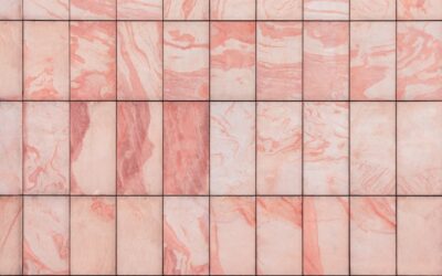
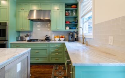
Once considered too daring for anywhere but a retro diner, the pink backsplash kitchen has become one of the most talked-about design moves in modern homes. From barely-there blush to punchy terracotta rose, pink brings a warmth and personality that neutral tile simply cannot, and the right shade reads as sophisticated rather than sweet. Whether you want a soft, calming backdrop or a bold statement wall behind your range, this guide covers the shades that work, the best tile materials, how to pair pink with cabinets and counters, and how to keep the look timeless.
Part of our Kitchen Remodeling guide — explore the full guide →
Why Pink Works in a Kitchen
The reason a pink backsplash kitchen feels fresh is that pink is, at its core, a warm neutral cousin. Muted, dusty, and earthy pinks behave much like a warm beige or terracotta, grounding a space and flattering both warm and cool palettes. They add a welcoming glow that makes a kitchen feel lived-in and personal instead of showroom-sterile.
Pink also plays beautifully with the materials kitchens are already made of. Against white cabinetry it feels crisp and cheerful; against deep green or navy it becomes rich and unexpected; against natural wood it turns cozy and organic. Because a backsplash is a relatively contained surface, it is the lowest-risk place to introduce a color like pink, letting you commit to personality without repainting the whole room or replacing cabinets.
Choosing the Right Shade
Not all pinks are created equal, and the shade you choose sets the entire mood of the kitchen.
- Blush and pale pink read as soft, airy, and barely-there, perfect for a subtle warmth that pairs with almost anything.
- Dusty rose and mauve feel muted and sophisticated, leaning into a moody, grown-up aesthetic that suits transitional and modern kitchens.
- Terracotta and clay pinks bring earthy warmth with an almost Mediterranean feel, gorgeous against wood and brass.
- Coral and salmon add lively energy and pair well with mid-century and eclectic styles.
- Bold hot pink makes a confident statement, best used in small doses or in playful, maximalist kitchens.
For a look that stays timeless, most designers steer toward the muted, dusty, and earthy end of the spectrum. These shades have staying power because they function as warm neutrals, whereas a bright bubblegum pink locks the kitchen into a specific, trend-driven moment.
Best Tile Materials for a Pink Backsplash
The material shapes how the color feels as much as the shade does. Glossy ceramic subway tile in blush is a classic, affordable choice that reflects light and keeps the look clean and bright. Zellige and handmade-look tiles bring subtle variation and an artisanal, imperfect surface that gives dusty pinks incredible depth and a high-end feel.
Glass mosaics add sparkle and a contemporary edge, while natural stone such as pink-toned marble or quartzite delivers luxury with organic veining. For a matte, modern statement, a large-format porcelain in terracotta pink covers the wall with minimal grout lines. Consider the finish carefully: glossy tiles amplify a soft pink and bounce light around, while matte finishes mute and sophisticate a bolder shade, keeping it from feeling loud.
Pairing Pink With Cabinets and Counters
The surrounding materials determine whether your pink backsplash feels chic or chaotic. Crisp white cabinets are the safest and most versatile partner, letting the pink glow without competition. For something richer, pair a dusty pink backsplash with deep forest green, navy, or charcoal cabinets, a combination that has become a designer favorite for its balance of warmth and depth.
Natural wood cabinetry, from light oak to walnut, wraps a terracotta or clay pink in cozy, organic harmony. On countertops, white or light gray quartz keeps things calm and lets the backsplash lead, while a warm-veined marble or a butcher-block counter reinforces an earthy palette. Metals matter too: brass and gold hardware amplify pink’s warmth, while matte black grounds it with contrast. Choose one direction, warm or cool, and let it guide the whole scheme.
Keeping the Look Timeless
The fear with any colored backsplash is that it will date quickly, but a few choices keep a pink kitchen looking intentional for years. Lean toward muted, earthy shades that behave like neutrals rather than trend-of-the-moment brights. Use classic tile shapes such as subway, square, or hexagon, which have endured for decades, instead of novelty patterns that pin the design to a passing fad.
Balance the pink with plenty of neutral surfaces so it feels like an accent, not the entire identity of the room. Keep the larger, more expensive elements, cabinets and counters, in flexible neutrals so that if you ever tire of the color, swapping a backsplash is far cheaper than a full remodel. Approached this way, pink becomes a warm, personal signature rather than a risky bet, and the backsplash stays as charming years from now as the day it went up.
Bringing Your Pink Kitchen to Life
Where to Place the Pink and How Much
Deciding how far to run a pink backsplash is as important as choosing the shade. The most common and lowest-risk approach is the standard backsplash zone, the strip between the countertop and the upper cabinets, which frames the pink as a contained band of color that ties the room together without overwhelming it. For a bolder statement, a full-height backsplash that runs from counter to ceiling behind the range or on an accent wall turns the pink into a true focal point, especially striking with a handmade or zellige tile whose surface variation reads as art. If you love the color but want to hedge, concentrate it behind the range or the sink and keep the rest of the backsplash neutral, giving you a hit of personality in the spot the eye naturally lands. The amount of pink also depends on your cabinet color; against bold navy or green lowers, a smaller run of pink balances the scheme, while an all-white kitchen can carry more pink before it starts to feel like a lot. Start conservative if you are unsure, since it is far easier to love a well-placed accent than to live with a wall of color you tire of.
A pink backsplash kitchen is proof that a little color in the right place transforms a space from generic to genuinely yours. Pick a shade that reads as a warm neutral, choose a tile material and finish that suits your kitchen’s style, and pair it thoughtfully with cabinets, counters, and metals in a coordinated warm or cool direction. Keep the surrounding elements neutral and flexible, and your pink backsplash will deliver personality, warmth, and a welcoming glow that makes the kitchen the heart of the home.