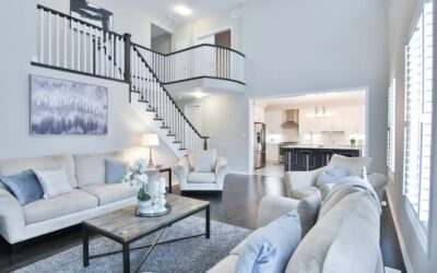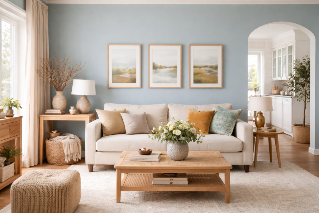
Despite the name, this color rarely reads as a true blue on the wall. Copen Blue Sherwin Williams paint (SW 0068) is a pale, heavily grayed blend of green and blue, and most people describe it as a misty sea-glass or soft spa green rather than a sky blue. Sherwin-Williams itself sorts it with its greens and its historic colors.
On the numbers side, Sherwin-Williams lists Copen Blue with a Light Reflectance Value (LRV) of 58.649, which rounds to about 59 and puts it in the light range. That means it bounces back a good share of the light in a room without looking stark. It is rated for both interior and exterior use, so it can work on walls, cabinets, trim accents and even siding or shutters.
- Copen Blue Sherwin Williams Specs at a Glance
- Understanding the Undertones
- Best Rooms and Sheens
- Colors That Pair Well With Copen Blue
- Copen Blue vs Upward, Sleepy Blue and Rainwashed
- How to Test and Apply It
- Troubleshooting Common Complaints
- General Cost Ranges and When to Call a Pro
- Frequently Asked Questions
Copen Blue Sherwin Williams Specs at a Glance
| Spec | Value | What it means |
|---|---|---|
| Color number | SW 0068 | Use this code when ordering so the store mixes the right formula |
| LRV | 58.649 (about 59) | Light; reflects plenty of light but is not a white |
| Hex | #C2CCC4 | Screen approximation only; monitors shift color |
| Color family | Green and historic colors on the maker’s site | Reads as a grayed green with a blue cast |
| Undertone | Green and blue, low saturation | Calm and muted; can look gray in dim rooms |
| Use | Interior and exterior | Walls, cabinets, doors, siding accents |
| Coordinating colors listed by the maker | Ivory Lace (SW 7013), Aquaverde (SW 9051) | A creamy white and a deeper blue-green |
| Best rooms | Bathrooms, bedrooms, laundry rooms, sunrooms | Spaces where a quiet, airy color helps |
The low saturation is the reason this shade is so forgiving. With so little color strength, it never shouts, but it also means room lighting has a big say in what you actually see. Always test a large sample on two walls before committing.
Understanding the Undertones
Paint colors have a mass tone (what you see at a glance) and an undertone (the hue that shows up in certain light or next to other colors). Copen Blue’s mass tone is a pale gray-green. Its undertone carries a hint of blue, which keeps it from feeling earthy or olive.
Here is how that tends to play out by room orientation:
- North-facing rooms: cool, indirect light pulls out the gray and blue. Expect a cooler, slightly stormier look.
- South-facing rooms: warm, strong light brings out the green. It can look fresh and minty at midday.
- East-facing rooms: bright and warmer in the morning, grayer in the afternoon.
- West-facing rooms: cooler in the morning, then warmed by evening sun.
- Artificial light: warm white bulbs (around 2700K) push it greener; cooler bulbs (4000K and up) push it bluer and grayer.
Flooring influences it too. Orange-toned oak can make the green side jump out, while gray or white-washed floors keep it reading cooler.
Best Rooms and Sheens
Bathrooms are the classic home for Copen Blue. Its spa-like softness works with white tile, chrome or brushed nickel, and natural wood vanities. Bedrooms benefit from its calm character, and laundry rooms or mudrooms get a clean, cheerful lift without the look of a bold color.
In a kitchen, it suits lower cabinets or an island paired with white uppers. On an exterior, it fits cottage, farmhouse and coastal styles, especially as a body color with crisp white trim or as a front door on a white house.
Sheen choice follows the room, not the color. Sherwin-Williams offers its colors across many product lines, and sheen options depend on the line you choose. As a general guide:
- Flat or matte: bedrooms, living rooms and ceilings, where hiding wall flaws matters more than scrubbing.
- Eggshell: most living areas and hallways; a little easier to wipe clean.
- Satin: bathrooms, kitchens, kids’ rooms and laundry rooms, where moisture and cleaning are frequent.
- Semi-gloss: trim, doors and cabinets.
Colors That Pair Well With Copen Blue
Sherwin-Williams lists two coordinating colors on the Copen Blue page: Ivory Lace (SW 7013), a creamy white with an LRV of 78.79, and Aquaverde (SW 9051), a deeper blue-green with an LRV of 48.932. Together they make a simple three-color scheme: Ivory Lace on trim and ceilings, Copen Blue on walls, and Aquaverde on an accent wall, a vanity or a front door.
Beyond the maker’s suggestions, these pairing approaches tend to work:
- Creamy or soft whites on trim: keep the look warm and traditional. Stark, blue-white trim can make Copen Blue look dingier by comparison.
- Warm wood tones: walnut, white oak and teak stain pull out the green side and feel natural.
- Charcoal or deep navy accents: give contrast on doors, islands or furniture.
- Brass and aged bronze hardware: add warmth; chrome keeps it crisp and cool.
- Linen, oatmeal and sand textiles: match the quiet, historic feel.
Copen Blue vs Upward, Sleepy Blue and Rainwashed
These four colors sit close in lightness, so the choice comes down to how much green or blue you want. All figures come from the Sherwin-Williams color pages.
| Color | LRV | Maker’s color family | How it reads next to Copen Blue |
|---|---|---|---|
| Copen Blue (SW 0068) | 58.649 | Green and historic | Gray-green with a blue cast |
| Rainwashed (SW 6211) | 59.055 | Green | Nearly identical; a hair lighter |
| Sleepy Blue (SW 6225) | 57.753 | Blue | More blue, with a soft aqua lean |
| Upward (SW 6239) | 57.401 | Blue | Clearly bluer and cooler, a grayed sky blue |
Rainwashed
This is the closest match by far. Its published hex value is only one or two steps off Copen Blue in each channel, and the LRV is within half a point. In practice, most people cannot tell them apart on a wall. If one is easier to get in the product line you want, use it.
Sleepy Blue
Pick Sleepy Blue if Copen Blue looks too green in your space. It shifts toward a light aqua blue while keeping the same muted, restful feel.
Upward
Upward is the choice for a true soft blue. It has a clearly blue hue rather than a green one, so it reads much cooler than Copen Blue, especially in north light.
How to Test and Apply It
- Sample big. Use peel-and-stick samples or paint a 2 foot by 2 foot poster board. Small chips exaggerate undertones.
- Test on two walls. Put one sample on the brightest wall and one on the darkest, then check morning, afternoon and night.
- Compare against your fixed finishes. Hold samples next to floors, tile, counters and trim.
- Prep the surface. Clean, patch and sand glossy areas. Prime over stains, patches or dark existing colors.
- Cut in, then roll. A good paint roller kit with a 3/8 inch nap cover suits most smooth to lightly textured walls. Keep a wet edge and roll in sections.
- Plan two coats. Light, low-saturation colors usually need two coats for even color over a primed or similar-color base.
If your home was built before 1978, test old paint for lead before sanding, and use lead-safe practices if it tests positive.
Troubleshooting Common Complaints
It looks too green
Warm bulbs and warm wood floors are the usual cause. Try cooler bulbs, or switch to Sleepy Blue or Upward.
It looks gray and flat
Dim, north-facing rooms mute it. Bring in brighter lighting, or choose a slightly more saturated blue-green from the same family.
The color looks patchy
Uneven sheen or skipped primer over patches causes flashing. Spot-prime the patches and apply a full final coat.
General Cost Ranges and When to Call a Pro
A gallon of quality interior paint usually covers about 350 to 400 square feet per coat, so an average bedroom needs roughly two gallons for two coats. Premium lines cost more per gallon but often cover better. Hiring a painter for a typical bedroom generally costs a few hundred dollars and up, depending on prep and region. Call a pro for high stairwells, two-story exteriors, cabinet refinishing that needs a sprayed finish, or homes where lead paint is present. Finally, before buying, confirm the current Copen Blue Sherwin Williams details on the maker’s color page, since collections and availability can change.
Frequently Asked Questions
Is Copen Blue blue or green?
It sits between the two. Sherwin-Williams groups it with its greens, and on the wall it usually reads as a soft gray-green with a blue cast.
What is the LRV of Copen Blue?
Sherwin-Williams lists the LRV as 58.649, which most people round to 59. That is a light color, though not a white.
What is the closest match to Copen Blue?
Rainwashed (SW 6211) is nearly identical, with an LRV of 59.055 and an almost matching hex value. Most viewers cannot tell them apart on a wall.
What trim color goes with Copen Blue?
Soft, creamy whites work well. The maker lists Ivory Lace (SW 7013) as a coordinating color, which suits trim and ceilings.
Can Copen Blue be used outside?
Yes. It is rated for interior and exterior use, and it suits cottage and coastal homes as a body color or a front door shade.