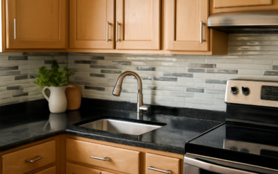
Maple cabinets age into a warm amber that can tip toward orange, especially under warm bulbs and next to beige walls. The right backsplash for maple cabinets pulls that warmth back into balance. In most kitchens, cool or neutral tile works best: soft white, gray-green, slate blue, or warm gray with a hint of cool undertone. These shades contrast with the yellow-orange of the wood without fighting it, so the cabinets read as rich honey rather than tangerine.
Part of our Kitchen Remodeling guide — explore the full guide →
What to avoid matters just as much. Tile in peach, terracotta, gold-beige, or creamy yellow repeats the cabinet’s undertone and intensifies it. The best pick also depends on how dark the maple has aged, what the countertop is doing, and even the color temperature of your light bulbs, so judge samples in your own kitchen.
- Why the Right Backsplash for Maple Cabinets Matters
- Best Tile Colors by Maple Finish
- Pairing With Your Countertop
- Tile Types and Finishes That Work
- Grout and Hardware Details
- Other Ways to Calm Orange Maple
- Five Proven Combinations
- Mistakes to Avoid
- Installation Notes and Safety
- Cost Ranges
- When to Call a Pro
- Frequently Asked Questions
Why the Right Backsplash for Maple Cabinets Matters
Maple is a tight-grained hardwood that ambers with light exposure. Clear-coated maple installed pale in the 1990s or 2000s is often a deep honey today. Oil-based finishes and warm stains add even more yellow. The backsplash sits between the upper and lower cabinets and touches both, so it acts as a color buffer across the whole kitchen.
Color theory explains why cool tiles help. Orange sits opposite blue on the color wheel. A blue-gray, slate, or green-gray tile does not need to be bold; even a whisper of cool undertone neutralizes some of the warmth. Crisp white works by sheer contrast, giving the eye a clean resting point next to the wood.
Best Tile Colors by Maple Finish
Natural or clear-coated maple (pale honey)
- Bright white or soft white ceramic subway tile: clean, inexpensive, and timeless.
- Pale sage or eucalyptus green: a natural partner for light wood that feels calm and organic.
- Light dove gray: keeps things airy without making the wood look yellow.
Honey or ambered maple (the orange problem)
- Slate blue or denim zellige-style tile: the strongest correction for orange.
- Charcoal or graphite: moody and grounding; the wood glows rather than shouts.
- Cool white with gray veining: marble-look porcelain adds movement and coolness.
- Muted green-gray: softer than blue, still cancels warmth.
Stained maple (cherry, espresso, or chestnut)
- Cherry-stained: creamy white, warm gray, or a pale stone. Avoid red-orange tile.
- Espresso or dark brown: almost anything light works; white, light gray, or a pale blue keeps the room from feeling heavy.
- Medium chestnut: soft greens, taupe-gray, or a cream that is not yellow.
Pairing With Your Countertop
The countertop often has more pattern than the cabinets, so let it lead. A good rule: if the counter is busy, the backsplash should be quiet, and if the counter is plain, the backsplash can carry pattern or texture.
- Busy granite (speckled browns, golds, blacks): choose a solid tile pulled from the least dominant color in the stone, often a gray or cream. Plain white subway or a neutral glass mosaic in one tone works.
- White or light quartz: the backsplash can add color. Blue-gray or green ceramic gives contrast to both wood and counter.
- Black or dark solid surfaces: white, light gray, or a patterned cement-look porcelain to bridge dark and warm.
- Butcher block: wood on wood can get monotonous; use crisp white or a cool tone to separate them.
- Laminate counters: pick tile that matches the laminate’s cooler tone to make the upgrade feel intentional.
Bring a cabinet door and a counter sample, or at least a large photo taken in daylight, when shopping. Tile samples should be viewed in your kitchen under both daylight and your evening lighting.
Tile Types and Finishes That Work
Material changes how color reads. Glossy tile reflects light and looks cooler; matte tile absorbs light and looks warmer and softer.
- Ceramic subway tile: affordable and easy to install. A glossy finish adds sparkle next to matte wood.
- Handmade-look or zellige-style tile: uneven glaze adds depth and texture that complements wood grain.
- Glass: cool by nature and reflective, good for brightening a dark kitchen.
- Marble or marble-look porcelain: gray veining introduces coolness without color.
- Natural slate or soapstone-look tile: dark gray tones settle warm wood.
- Stacked stone: works in rustic kitchens if you choose gray stone rather than tan.
Layout ideas
A classic running bond suits traditional maple shaker doors. Vertical stack or herringbone feels more updated and can make a short wall look taller. Larger 4×12 or 3×12 formats reduce grout lines and read as calmer next to the busy grain of maple.
Grout and Hardware Details
Grout color can undo a careful tile choice. Bright white grout with white tile looks crisp but shows stains; a light warm gray is more forgiving. With colored tile, match the grout closely to the tile for a solid wash of color, or use a slightly darker shade for subtle definition. Avoid beige and tan grouts with honey maple, since they echo the orange.
Hardware ties the room together. Matte black or brushed nickel pulls cool down maple, while brass and copper amplify warmth. If you love warm metals, balance them with a cooler backsplash.
Other Ways to Calm Orange Maple
The backsplash is only one lever. Change bulbs to a neutral color temperature (around 3000K to 3500K) instead of very warm 2700K; this alone often reduces the orange cast. Repaint walls in cool white, soft gray, or muted green. Add under-cabinet lighting so the backsplash is evenly lit. Some homeowners paint just the island in a contrasting color and keep the perimeter maple, which balances the room without losing the wood.
If your cabinets are noticeably orange from an old oil finish, a professional refinisher can sometimes apply a toned clear coat to shift the color. That is a larger project, but it pairs well with a fresh backsplash.
Five Proven Combinations
- Honey maple, speckled tan granite, white 3×6 ceramic subway with light gray grout: the most budget-friendly fix, crisp and familiar.
- Natural maple, white quartz, sage green handmade-look tile: fresh and calm, with a slightly organic feel.
- Ambered maple, black counters, slate blue vertical stack tile: bold, modern, and the strongest correction for orange.
- Cherry-stained maple, cream quartz, marble-look porcelain with gray veining: elegant and traditional.
- Espresso maple, butcher block island, glossy white herringbone: bright contrast that keeps a dark kitchen from feeling closed in.
Treat these as starting points. Pin a large tile sample next to a cabinet door for a few days and look at it morning, afternoon, and evening before you commit. A backsplash for maple cabinets that looks perfect in a showroom can read very differently under your own bulbs and window light.
Mistakes to Avoid
- Choosing tile under the store’s cool lighting without checking it at home.
- Picking beige or tan tile because it feels safe; it usually intensifies orange.
- Using a busy mosaic over a busy granite.
- Ignoring the wall paint, which covers more area than the backsplash.
- Matching wood tones with wood-look tile, which tends to clash rather than blend.
Installation Notes and Safety
Most backsplash tiles go up with polymer-modified thinset or a premixed adhesive on drywall. Before working around outlets, turn off the breaker, confirm the outlet is dead with a non-contact voltage tester, and remove cover plates. Cut tile wet when possible and wear a respirator for dry cuts, since tile dust contains silica. Use silicone, not grout, where the tile meets the counter.
Cost Ranges
Basic ceramic subway tile is among the least expensive options, often just a few dollars per square foot. Handmade-look tile, glass mosaics, and marble-look porcelain land in the mid-range, and natural marble or true zellige sit higher. A typical 30-square-foot kitchen backsplash can cost from a couple hundred dollars in DIY materials to well over a thousand installed with premium tile. Professional labor is usually priced per square foot with a minimum charge.
When to Call a Pro
A designer or experienced tile showroom can help if your kitchen has competing woods, a heavily patterned granite, or poor natural light. Hire a tile installer for glass, natural stone, or intricate patterns like herringbone, which require careful layout. If outlets need to move to fit your new design, that work belongs to a licensed electrician.
Frequently Asked Questions
What color backsplash goes with honey maple cabinets?
Cool or neutral shades work best. Slate blue, gray-green, charcoal, and cool white all balance the amber tone. Avoid peach, gold, and tan tiles that repeat the orange.
Does white subway tile work with maple cabinets?
Yes. White ceramic subway tile is one of the most reliable choices because it contrasts with the wood and brightens the kitchen. Choose a white that is not overly creamy.
Should the backsplash match the countertop or the cabinets?
Coordinate with both, but take the lead from the countertop. If the counter is busy, keep the backsplash solid and quiet; if it is plain, the backsplash can add color or pattern.
Is gray tile good with maple?
Gray tile with a cool undertone is excellent with maple. Warm greige tiles can look muddy, so compare samples next to a cabinet door before buying.
How can I make maple cabinets look less orange without painting them?
Use a cool-toned backsplash, switch to neutral-temperature bulbs, repaint walls in a cool color, and pick black or nickel hardware. Together these changes noticeably reduce the orange effect.