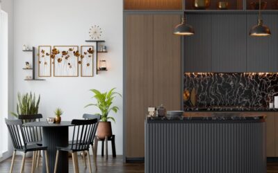
Neutral does not have to mean boring, and a taupe backsplash proves it. Taupe is that hard-to-pin-down blend of gray and brown, a warm neutral that shifts subtly with the light and pairs with almost anything. It brings the calm, timeless quality of a neutral wall without the starkness of pure white or the coldness of gray. For homeowners who want a backsplash that feels sophisticated today and still looks right a decade from now, taupe is one of the smartest choices on the color wheel. This guide covers why it works, which materials suit it, how to pair it, and what it costs.
Part of our Kitchen Remodeling guide — explore the full guide →
- What Makes Taupe Such a Versatile Color
- Tile Materials for a Taupe Backsplash
- Pairing Taupe With Cabinets and Countertops
- Design Styles That Suit Taupe
- Cost of a Taupe Backsplash
- Grout and Layout Considerations
- Understanding Taupe's Undertones
- Lighting and How Taupe Reads
- Keeping a Taupe Backsplash Looking Fresh
- The Bottom Line
What Makes Taupe Such a Versatile Color
Taupe sits between gray and brown, borrowing the softness of one and the warmth of the other. That in-between quality is exactly what makes it so useful. In a north-facing kitchen with cool light, taupe reads warmer and grounds the room. In warm afternoon light, it can lean more gray and refined. This chameleon behavior lets a single backsplash flatter changing light and different decor over the years.
Because it is a true neutral, taupe never fights with your cabinets, counters, or appliances. It provides a quiet backdrop that lets other elements shine while still feeling intentional and warm rather than flat.
Tile Materials for a Taupe Backsplash
Taupe shows up across nearly every backsplash material, so you can chase the exact texture and finish you want:
- Ceramic and porcelain subway tile: The most budget-friendly route, available in glossy and matte taupe glazes.
- Natural stone: Travertine, limestone, and some marbles carry gorgeous natural taupe and greige tones.
- Glass tile: Adds sheen and depth, with taupe glass reflecting light beautifully.
- Zellige and handmade tile: Variegated taupe glazes give an artisan, textured look with subtle color movement.
Finish changes the mood. A glossy taupe tile brightens and reflects light, while a matte or honed surface reads calm and contemporary. Textured tiles like a taupe zellige add hand-crafted character.
Pairing Taupe With Cabinets and Countertops
Taupe’s superpower is how easily it coordinates. A few combinations consistently look polished:
- White cabinets: A taupe backsplash warms up an all-white kitchen and softens the contrast, keeping it from feeling clinical.
- Gray cabinets: Taupe bridges warm and cool tones, tying gray cabinetry to wood floors and warm accents.
- Wood and stained cabinets: Taupe echoes the brown undertones for a cohesive, organic look.
- White or gray quartz counters: Neutral counters let the backsplash provide gentle warmth without clashing.
The safest approach is to test the taupe against your actual cabinet and counter samples, because taupe’s undertone can lean pink, green, or gray depending on the tile.
Design Styles That Suit Taupe
Taupe is at home across a surprising range of kitchen styles. In a modern kitchen, a large-format matte taupe tile with tight grout lines feels sleek and minimal. In a transitional space, a classic taupe subway tile with a soft-contrast grout strikes a timeless balance. For farmhouse and rustic looks, a handmade or travertine taupe backsplash brings warmth and texture that fits the aesthetic perfectly.
Because taupe is understated, it also plays well with bolder elements elsewhere. If you have a statement range hood, patterned floor, or dramatic countertop, the backsplash keeps the room balanced rather than competing for attention.
Cost of a Taupe Backsplash
Since taupe is a color rather than a material, cost tracks with the tile you choose. Plan around these ranges for the backsplash area:
- Ceramic and porcelain: $2 to $10 per square foot.
- Glass tile: $10 to $30 per square foot.
- Natural stone: $10 to $40 per square foot.
- Installation: $10 to $20 per square foot depending on tile size and pattern.
Because a backsplash covers a small area, usually 25 to 40 square feet, even a premium taupe stone stays affordable compared with larger tiling projects. A typical kitchen backsplash lands somewhere between $500 and $2,000 installed.
Grout and Layout Considerations
Grout color shapes how a taupe backsplash reads. A matching taupe or greige grout creates a seamless, monolithic look that emphasizes the color and any texture. A slightly darker grout defines each tile and adds a subtle graphic rhythm. Avoid stark white grout with taupe tile unless you want strong contrast, since it can make the wall look busier than intended.
Layout adds another layer of interest. A classic running-bond subway pattern is timeless, a vertical stack feels modern, and a herringbone arrangement in taupe adds movement while keeping the calm neutral palette.
Understanding Taupe’s Undertones
The trickiest part of working with taupe is its undertone, because the same tile can look warmer or cooler depending on what surrounds it. Some taupes lean pink or mauve, others lean green or gray, and a few carry a beige, almost tan warmth. That undertone is what makes a tile feel harmonious or slightly off against your cabinets and counters.
- Pink-leaning taupe: Reads soft and warm, flattering with cream and beige finishes.
- Green-leaning taupe: Feels earthy and calm, pairing well with natural wood and warm metals.
- Gray-leaning greige: The most versatile, bridging cool and warm palettes with ease.
To spot the undertone, hold the tile next to a pure white sheet of paper. The contrast reveals whether the color pulls pink, green, or gray, which helps you predict how it will behave in your kitchen.
Lighting and How Taupe Reads
Light dramatically changes how this neutral appears throughout the day, so it pays to test samples in your actual space. Cool north-facing light tends to emphasize the gray side of the color, while warm western afternoon light brings out its brown warmth. Under yellow-toned incandescent bulbs, the tile reads cozier; under cooler LED lighting, it can look crisper and more contemporary.
Tape a few tile samples to the wall and observe them at morning, midday, and evening before you buy. A shade that looks perfect in the showroom’s bright lighting can feel muddy or washed out in your kitchen. This simple step prevents the most common regret with neutral tile, which is choosing a color that never quite looks the way you expected once it is installed.
Keeping a Taupe Backsplash Looking Fresh
Taupe is a forgiving color for everyday kitchen life. Its mid-tone depth hides minor splatter and water spots better than bright white, so it stays looking clean between deep cleans. Wipe it down with a pH-neutral cleaner, and if you chose natural stone like travertine, seal it to protect against grease and acidic spills. Sealed grout keeps the lines from darkening over time.
If you love the warm neutral look but want a little more depth, consider adding subtle variation within the tile itself. A blend of two or three close taupe shades, a tile with gentle marbling, or a handmade glaze with natural color movement keeps a neutral wall from reading flat. You can also introduce texture through a three-dimensional or fluted tile, which catches light and adds shadow without changing the color palette at all. These touches let a quiet neutral still feel considered and custom, which is exactly what keeps it from looking like a builder-grade default.
The Bottom Line
A taupe backsplash offers the best of both worlds: the timeless calm of a neutral with the warmth that pure white and cool gray lack. It coordinates effortlessly with white, gray, and wood cabinetry, flatters changing light, and suits modern, transitional, and farmhouse kitchens alike. Choose the material and finish that match your style, test the undertone against your cabinets and counters, and pick a complementary grout. The result is a backsplash that feels sophisticated now and stays relevant for years to come.