White counters are the easiest surface in the kitchen to pair and the easiest to ruin, because choosing backsplash tile for white countertops looks foolproof right up until two slightly different whites land next to each other and both suddenly look dirty. I have watched homeowners agonize over a bold navy tile that turned out beautifully, then torpedo a $6,000 quartz install with a white subway tile that clashed by two shades. Picking backsplash tile for white countertops is really two decisions: whether to match or contrast, and then how to execute whichever one you chose without the undertones fighting. Here is how to get both right.
Part of our Countertops guide — explore the full guide →
First, Figure Out What Kind of White You Have
No countertop is plain white. Every white quartz, granite, and marble leans warm or cool, and that undertone is the reference point for every tile decision that follows. Warm whites carry cream, beige, or gold: think Caesarstone London Grey’s soft veining, Silestone Lagoon, or a granite like River White with its warm garnet flecks. Cool whites carry gray or blue: Silestone Iconic White, MSI Arctic White, and most Carrara and Statuario marble with their gray veining sit firmly on the cool side.
Test yours in thirty seconds. Set a sheet of plain white printer paper on the counter in daylight. If the counter looks yellowish or creamy next to the paper, it is warm. If it looks gray or icy, it is cool. Then look at the veining or flecks, because the vein color, gray, taupe, gold, matters as much as the field. A Calacatta-look quartz with gold veining wants warm companions even though its field reads bright white. Write down what you find and take a photo in daylight, because you will be standing in a tile showroom under fluorescent light making a $1,500 decision from memory otherwise.
Matching White on White Without the Clash
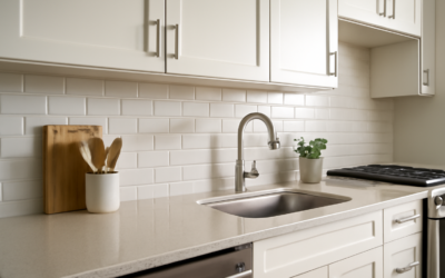
White tile over white counters is the classic move, and it fails in exactly one way: mismatched undertones. A cool blue-white subway against a creamy quartz makes the counter look yellowed and stained. A warm ivory tile against icy Arctic White makes the tile look like it needs bleaching. The eye cannot ignore two near-identical whites side by side; it compares them relentlessly, and the warmer one always loses.
The fix is simple discipline. Bring a physical sample of your countertop, a remnant or the manufacturer sample chip, and hold every tile candidate directly against it in daylight. You are not looking for an exact match, which is nearly impossible across different materials. You want the same temperature family. Warm counter, warm tile: something like Bedrosians Cloe in white or a creamy handmade look. Cool counter, cool tile: a crisp bright subway like Daltile Restore in Bright White works because it stays neutral-to-cool. If you cannot find the right temperature, deliberately step the tile a shade off-white, a pale greige, soft dove gray, or the faintest blush, so the eye reads two intentional colors instead of one failed match. Texture also rescues white-on-white: a rippled zellige or a handmade-edge subway in near-matching white adds shadow and movement, so the pairing reads as layered rather than flat.
Contrast Plays That Earn Their Keep
White counters are the best possible launching pad for a colored backsplash because they calm down anything above them. Navy is the safest bold choice; a glossy navy subway or picket tile against white quartz reads classic rather than trendy, and it hides cooking splatter better than any white wall ever will. Sage and eucalyptus greens have earned permanent status, pairing especially well with warm whites and brass hardware. Black or charcoal, in matte hex or a soft-glaze subway, gives a tailored look but demands good task lighting because it absorbs light over the work zone.
Terracotta and clay pinks warm up a cool white counter dramatically and work best in kitchens that get real daylight. Zellige in almost any color is the current favorite for good reason: the hand-cut Moroccan tile’s uneven glaze throws light around and its color variation means it never reads flat, though its irregular faces mean higher installation labor and grout lines that will never be perfectly uniform, which is the point. Patterned cement-look porcelain, an 8×8 with a Moorish or encaustic-style print, turns the backsplash into the room’s focal point; keep it to one wall or the range zone, pull one color from the pattern for your wall paint, and keep everything else quiet. With any strong contrast, the white counter is doing the work of a visual resting place. Do not fight it by adding a busy floor too.
Grout Color Decides More Than You Think
Grout is 10 to 15 percent of the visible surface and it can restyle the same tile three ways. Matching grout to tile, white on white with something like Mapei Warm Gray or Avalanche depending on temperature, makes the wall read as one seamless surface, the right call for calm minimalist kitchens. Contrasting grout, charcoal lines on white subway, outlines every tile and turns the layout into a visible grid; it photographs boldly but it also highlights every imperfect cut, so only pair it with a very good installer. The middle path, a light gray or greige grout one or two shades off the tile, adds definition without shouting and hides everyday grime far better than bright white grout, which is the highest-maintenance choice over a cooking zone.
Match the grout undertone to your countertop the same way you matched the tile. And spend the extra on quality: an upgrade from standard cement grout to a high-performance option like Mapei Ultracolor Plus FA or Custom’s Prism runs $15 to $30 more for a whole backsplash and resists the staining and blotchy curing that make white grout look old in a year. Sealing cement grout, a $20 bottle of penetrating sealer and twenty minutes, is not optional above a range.
Finishes, Sizes, and Patterns
Glossy tile bounces light and makes small kitchens feel bigger, and its glaze wipes clean with a damp cloth, which is why glossy subway remains the default over work zones. Matte finishes look more current and hide water spots and smudges, but textured matte surfaces hold grease film near the range and need actual scrubbing rather than a wipe. Many of the best kitchens mix them: matte field tile with a glossy accent, or glossy zellige against honed counters so the surfaces trade roles.
On size, small tile means more grout lines and more visual energy; large-format 4×12 or 12×24 means calmer walls and fewer joints to clean. Standard 3×6 subway in running bond is timeless. Stacked vertical installation of the same tile modernizes it instantly and draws the eye upward, useful under 8-foot ceilings. Herringbone adds motion and roughly doubles installation labor. Picket, hex, and elongated hex shapes give personality without pattern-level busyness. The honest rule: the bolder your tile color, the simpler the layout should be, and vice versa. Navy herringbone with contrasting grout is three statements stacked on one wall; pick one.
What the Common Options Cost
Budget in two layers, tile and labor, and expect labor to match or exceed the tile cost on most backsplashes. For material: basic ceramic subway runs $2 to $6 per square foot, and the glass and stone mosaic sheets sold at big-box stores run $8 to $20. Patterned cement-look porcelain lands at $6 to $15, picket and hex shapes at $7 to $18, real zellige at $15 to $34 from importers like Zia Tile or clé, and marble mosaics at $12 to $30 and up. A typical 30-to-40-square-foot kitchen therefore carries anywhere from $120 in builder ceramic to $1,200-plus in handmade zellige before anyone mixes thinset. Installation labor adds roughly $10 to $40 per square foot depending on tile and pattern complexity, so a realistic all-in range for the whole project is $700 to $2,500 for most kitchens.
Spend where it shows. Over white counters, the backsplash is the most visible vertical surface in the room, and the difference between $4 tile and $16 tile on 35 square feet is $420, less than most people spend on a faucet. Order 10 to 15 percent overage, check that every box shows the same dye lot, and lay out a dry run of at least one full row before committing. White counters will forgive a bold choice or a quiet one, but they never forgive a careless one.