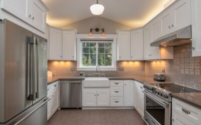
White cabinets are the most popular kitchen choice in America for a reason — they are timeless, bright, and endlessly flexible. But that same neutrality means the backsplash carries the weight of the design. Choosing the right backsplash tile for white cabinets is what separates a kitchen that feels custom from one that feels unfinished. The good news is that white pairs beautifully with nearly everything, which gives you room to lean classic, bold, or somewhere in between.
Part of our Kitchen Remodeling guide — explore the full guide →
- Why White Cabinets Give You So Many Options
- Classic Subway Tile
- Adding Color and Contrast
- Marble and Natural Stone
- Mosaic and Pattern Tiles
- Grout: The Detail That Changes Everything
- Countertops Tie It Together
- Making the Final Choice
- Matching the Tile to Your Hardware and Fixtures
- Layout Patterns That Add Interest
- Frequently Asked Questions
Why White Cabinets Give You So Many Options
Because white is a neutral, it does not compete with color or pattern the way a stained oak or navy cabinet does. That freedom is a double-edged sword: with so many possibilities, homeowners often freeze. The trick is to decide first what mood you want the kitchen to have. Do you want it calm and airy, warm and traditional, or crisp and high-contrast? Each direction points to a different family of tile.
Keep in mind that white cabinets come in shades too — from bright chalky whites to creamy antique whites with yellow undertones. Bring a cabinet door sample when you shop so you can match undertones rather than fighting them. A cool cabinet next to a warm cream tile can make both look slightly off.
Classic Subway Tile
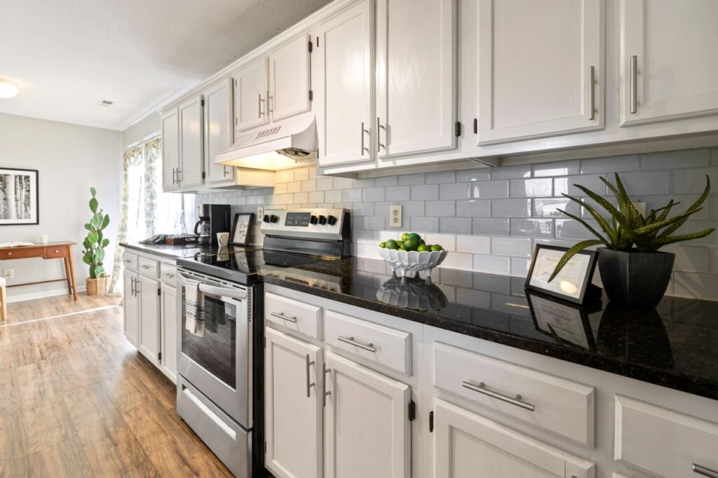
The 3-by-6-inch white subway tile remains the default for good reason. It is inexpensive, usually $2 to $8 per square foot, and it delivers a clean, timeless backdrop that will not date quickly. With white cabinets, an all-white subway backsplash creates a serene monochrome look, especially in small or galley kitchens where you want the space to feel larger.
To keep an all-white scheme from looking flat, change one variable. A gray or greige grout adds definition and outlines each tile. A stacked vertical or herringbone layout brings movement without adding color. A handmade or zellige-style subway tile introduces subtle surface variation and light play that flat ceramic cannot match.
Adding Color and Contrast
White cabinets are the perfect canvas for a colored backsplash. Because the uppers stay neutral, a bold tile reads as intentional rather than chaotic. Popular high-impact choices include:
- Deep blue or navy — creates a nautical or moody-elegant feel and hides splatter well
- Sage or soft green — a warm, organic pairing that feels current without being trendy
- Terracotta or blush — adds Mediterranean warmth against crisp white
- Black or charcoal — delivers dramatic contrast for a modern or bistro look
If a fully colored wall feels like too much of a commitment, run a colored tile only behind the range or sink as a focal accent and keep the rest white. This limits both cost and risk while still giving the kitchen a personality.
Marble and Natural Stone
For a luxury feel, marble backsplashes — whether genuine Carrara, Calacatta, or a porcelain marble-look tile — pair exquisitely with white cabinets. The gray veining supplies just enough contrast to keep the space from feeling washed out, and the material reads as high-end even when the porcelain version costs a fraction of real stone.
Genuine marble runs $10 to $40 per square foot and needs periodic sealing because it etches from acids like lemon and vinegar. Porcelain slabs and marble-look tiles avoid that maintenance entirely and now mimic the veining convincingly. In a kitchen backsplash, where the surface sees splashes and grease, many homeowners find the porcelain trade-off well worth it.
Mosaic and Pattern Tiles
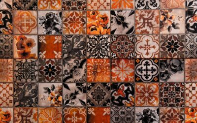
Mosaic sheets — small hexagons, penny rounds, or marble-and-glass blends — let you add texture and interest while staying in a light palette. A gray-and-white marble hexagon mosaic, for instance, brings pattern without color commitment. On the bolder end, patterned cement or encaustic-look tiles turn the backsplash into the kitchen’s centerpiece, which works especially well in farmhouse and eclectic designs where white cabinets keep the busy pattern grounded.
Just be careful about scale. In a small kitchen, a large-scale busy pattern can overwhelm the room. Reserve the boldest patterns for a defined area or a larger kitchen with plenty of visual breathing room.
Grout: The Detail That Changes Everything
Grout color is the most underrated decision in any backsplash. With white tile and white cabinets, your grout choice sets the entire tone. White grout keeps things seamless and airy but shows dirt and needs more upkeep. Gray grout adds a subtle grid that defines the pattern and hides everyday grime. A dark grout with white tile creates a graphic, high-contrast statement that has become a modern-farmhouse signature.
Whatever you choose, use a stain-resistant epoxy or a quality sealed cement grout in a kitchen. The area behind the stove takes the most abuse, and a sealed grout wipes clean instead of soaking up grease.
Countertops Tie It Together
Your backsplash tile for white cabinets should never be chosen in isolation from the countertop. A white quartz counter with subtle veining pairs cleanly with almost any tile. A busy granite counter, on the other hand, calls for a quieter backsplash so the two do not fight. When both surfaces are patterned, the eye has nowhere to rest.
A reliable formula: let one surface be the star and the other the supporting act. If you fell in love with a dramatic patterned tile, keep the counter solid. If you have a striking marble or granite counter, choose a simple subway or solid tile behind it.
Making the Final Choice
Order samples and tape them to the wall before you commit. Kitchen lighting — both natural and artificial — dramatically changes how a tile reads, and a color that looked perfect in the showroom can turn cold or yellow at home. Live with the samples for a few days and view them morning and night.
Whether you land on timeless white subway, a bold navy accent, or elegant marble, white cabinets will make your backsplash look intentional and polished. That flexibility is exactly why white remains the smartest long-term choice for a kitchen you will keep for years.
Matching the Tile to Your Hardware and Fixtures
The metal tones in your kitchen — cabinet pulls, faucet, lighting, and range — should inform the backsplash choice as much as the cabinets do. A warm brass or gold hardware scheme pairs beautifully with cream-and-white or terracotta tile, reinforcing a warm, collected look. Cooler chrome and stainless fixtures lean toward crisp white, gray-veined marble, or blue tile.
You do not need everything to match perfectly, but the tones should relate. A common mistake is choosing a cool, gray-toned tile in a kitchen full of warm brass, which leaves the two elements fighting. Pull a sample of your hardware and hold it against the tile before buying to make sure the undertones live together comfortably.
Layout Patterns That Add Interest
Even with a plain white tile, the layout you choose changes the whole feel of the wall. A standard offset (running bond) brick pattern is the classic, safe choice. A stacked layout — tiles aligned in a straight grid — reads more modern and architectural. Herringbone and chevron add movement and a custom, high-end feel that suits a focal wall behind the range.
Vertical stacking is a designer trick for making low ceilings feel taller, while horizontal runs widen a narrow galley. If you want visual interest without color, choosing an interesting layout is the cheapest way to get it, since the tile itself costs the same regardless of how it is set.
Frequently Asked Questions
Should the backsplash match the countertop or the cabinets?
Neither exactly. The backsplash should coordinate with both while letting one surface be the star. If the counter is busy, keep the tile simple; if the counter is solid, the tile can carry the pattern.
Is white subway tile out of style?
No. It is a timeless classic that rarely dates. To keep it fresh, vary the grout color or layout rather than assuming you need a trendier tile.
How high should the backsplash go?
Standard is up to the underside of the upper cabinets, about 18 inches above the counter. Taking tile to the ceiling behind a range or open shelving creates a dramatic, upgraded look.
Prefer to explore on your own?
See how new flooring looks in your actual room in seconds — free, no signup.
Try the free Floor Studio →