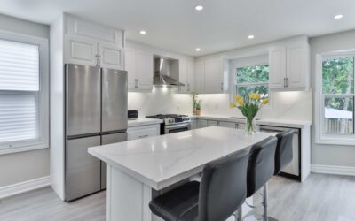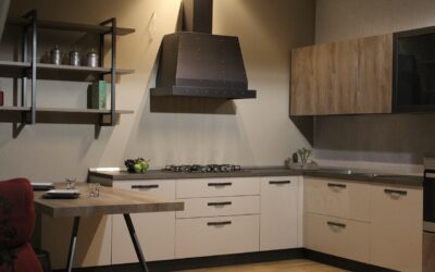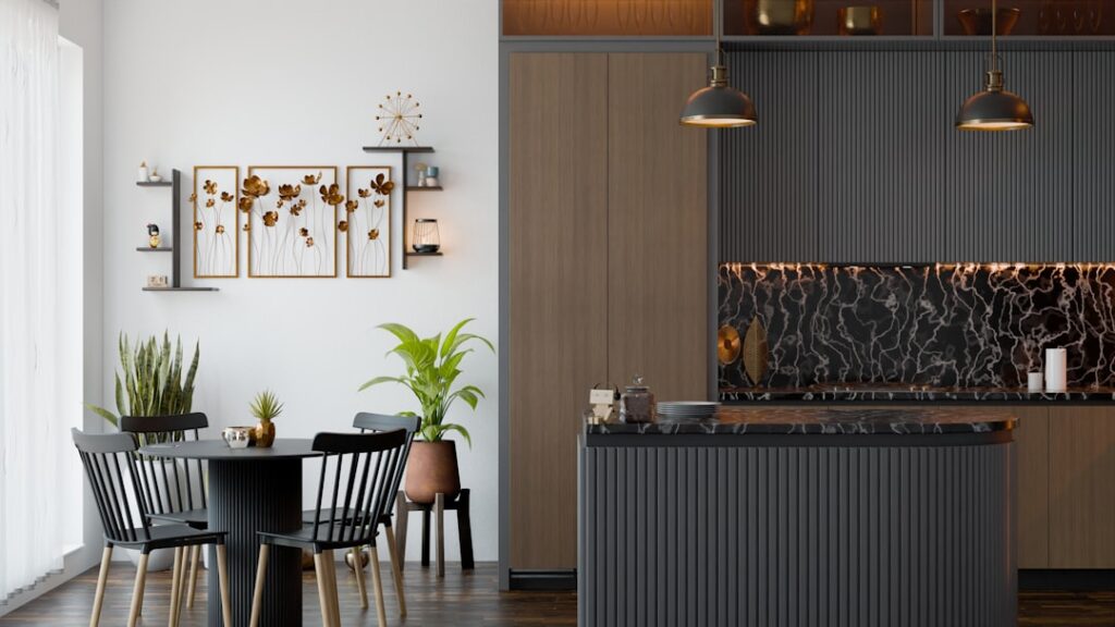
Sherwin-Williams Accessible Beige, color code SW 7036, has quietly become one of the most-requested cabinet colors of the past few years, and there is a reason it keeps showing up in “before and after” photos. Accessible beige kitchen cabinets sit in that sweet spot between cool gray and warm tan, the shade designers call greige, which flatters almost any countertop and forgives the fingerprints and crumbs that plague both stark white and deep navy. If you are tired of the cold gray kitchens that dominated the last decade but not ready for a bold color, this is the neutral worth studying before you commit a gallon of paint.
Part of our Kitchen Remodeling guide — explore the full guide →
What Accessible Beige Actually Looks Like
Accessible Beige reads as a soft, warm taupe with a light-reflectance value around 58, meaning it bounces a fair amount of light and keeps a space feeling open rather than heavy. That LRV is the number to remember. It is light enough to work in a smaller kitchen without darkening the room, yet deep enough to hide the scuffs and shadows that make bright white cabinets look grubby by dinnertime.
The color carries subtle warm undertones, which is precisely why it has overtaken the cooler grays of the 2010s. Where a cold gray can feel clinical, Accessible Beige feels grounded and inviting. It shifts with the light, leaning slightly more taupe in daylight and warming toward soft tan under incandescent bulbs, which brings us to the most important buying consideration.
Lighting Changes Everything
No paint chip tells the whole story, because a color’s undertone can swing dramatically depending on the light in your kitchen. Accessible Beige is generally forgiving, but you should still test it in your own space before committing:
- North-facing rooms get cool, indirect light that can pull the beige slightly gray and muted.
- South-facing rooms flood with warm light that emphasizes the taupe warmth and can make it glow.
- LED bulb temperature matters: 2700K bulbs warm it up, while 4000K daylight bulbs cool it down.
Paint a large sample board, at least two feet square, and move it around the kitchen across a full day. Check it in morning light, afternoon sun, and under your evening bulbs. What looks perfectly warm at noon can drift oddly beige-pink or gray-green under the wrong artificial light.
Countertops That Complement It
Because Accessible Beige is a true neutral, it partners with a wide range of counter materials, but some pairings sing louder than others. The goal is usually contrast plus harmony, letting the cabinets read as warm without the whole kitchen turning into a flat wash of tan.
- White or cream quartz with subtle veining brightens the space and keeps the greige from feeling too muddy.
- Warm-veined marble or marble-look quartz picks up the beige undertones for an elegant, cohesive look.
- Black or charcoal granite delivers bold contrast that makes the cabinets pop and grounds the room.
- Butcher block or wood counters lean into the warmth for a cozy farmhouse or transitional feel.
Steer clear of countertops with strong cool-blue or green undertones, which can fight the beige and make it look dingy by comparison.
Hardware, Backsplash, and Fixtures
The finishes you hang on beige cabinets set the entire mood. Warm metals amplify the color’s cozy side, while cooler metals add crisp contrast. Brushed brass and champagne bronze are the current favorites, echoing the warmth for a soft, upscale look. Matte black hardware, by contrast, adds a modern, high-contrast edge that keeps the kitchen from feeling too soft.
For the backsplash, a creamy white subway tile or a warm-toned zellige keeps things classic, while a natural stone mosaic reinforces the organic feel. Avoid a stark, blue-white tile that will make the cabinets look yellow by contrast. Faucets in brushed gold, matte black, or brushed nickel all work; just try to echo whichever metal you chose for the cabinet hardware so the room reads as intentional.
Where It Works Best
Accessible Beige is a chameleon, which is exactly why it fits so many kitchen styles. It reads as classic in a traditional kitchen with shaker doors and brass pulls, and it turns modern-organic when paired with flat-panel fronts, wood accents, and matte black fixtures. Transitional kitchens, the ones blending old and new, are its natural home.
It is a particularly smart choice for homeowners planning to sell within a few years. As a broadly appealing warm neutral, it photographs beautifully and rarely alienates buyers the way a bold color can. It also plays well with existing wood floors in nearly any tone, from pale oak to rich walnut, which spares you a flooring change during a cabinet refresh.
Painting Cabinets Versus Buying New
If you love your cabinet boxes and doors, painting is the budget route to this look. A professional cabinet-painting job runs roughly $2,000 to $6,000 for an average kitchen, a fraction of the $10,000-plus for new cabinetry. The key is proper prep: cabinets must be degreased, sanded, and primed before the color goes on, or the finish will chip and peel within a year.
For a DIY approach, plan on a full weekend or two, use a bonding primer, and finish with a durable enamel or a sprayed lacquer for the smoothest result. Whether you paint or buy new, request the exact Sherwin-Williams SW 7036 formula, and consider a satin or semi-gloss sheen that wipes clean easily in a high-traffic kitchen.
How It Compares to Other Popular Neutrals
Accessible Beige rarely gets chosen in a vacuum, so it helps to know how it stacks against its closest rivals. Against Sherwin-Williams Agreeable Gray, another greige favorite, Accessible Beige runs noticeably warmer and more tan, while Agreeable Gray leans cooler and grayer. If your kitchen already has warm wood floors or brass fixtures, Accessible Beige harmonizes more naturally.
Compared with a crisp white like Alabaster, the beige hides fingerprints, splatters, and everyday scuffs far better, which is a genuine advantage in a working kitchen with kids or heavy cooking. Against a bolder color like a deep green or navy, it plays the safe, broadly appealing card, easier to live with long-term and easier to sell. The right choice comes down to your undertones elsewhere in the room and how much warmth you want the cabinets to project.
Coordinating Walls and Trim
Once the cabinets are set, the surrounding walls and trim need to support them rather than compete. A common and reliable approach is pairing Accessible Beige cabinets with walls in a lighter tint from the same warm family, or a soft white with warm undertones, so nothing clashes. Sherwin-Williams even offers coordinating colors designed to sit alongside SW 7036 without fighting its undertone.
For trim and ceilings, a clean warm white keeps the room from feeling flat and gives the beige something crisp to play against. Avoid a stark, blue-based white, which can make the cabinets look muddy or yellow by contrast. When the walls, trim, and cabinets all share a consistent warm undertone, the kitchen reads as calm and intentional rather than a collection of mismatched neutrals.
Final Word
The staying power of accessible beige kitchen cabinets comes from genuine versatility. This warm greige flatters a huge range of counters, floors, and finishes, hides everyday wear better than white or gray, and reads as timeless rather than trendy. Test it against your own light before committing, pair it with countertops and hardware that respect its warm undertone, and you will land a kitchen that feels inviting today and still looks current a decade from now.